Most mobile apps do not fail because of poor features. They fail because users never come back.
Within the first week, the majority of users drop off. Not because they explored the app and didn’t like it, but because they never experienced enough value to return.
This is a design problem, and solving it requires a strong foundation in mobile app development and UX strategy.
Retention is not built through notifications, discounts, or reminders. It is shaped in the first session, influenced by friction points, and reinforced by how the product makes users feel over time.
In this blog, we have broken down what actually drives retention. We talk about mobile app ux in 2026, design choices, along with human psychology that decides whether the user wants to return or not.
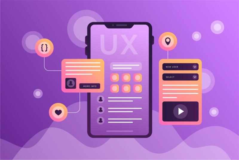
What Is Mobile App Retention UX?
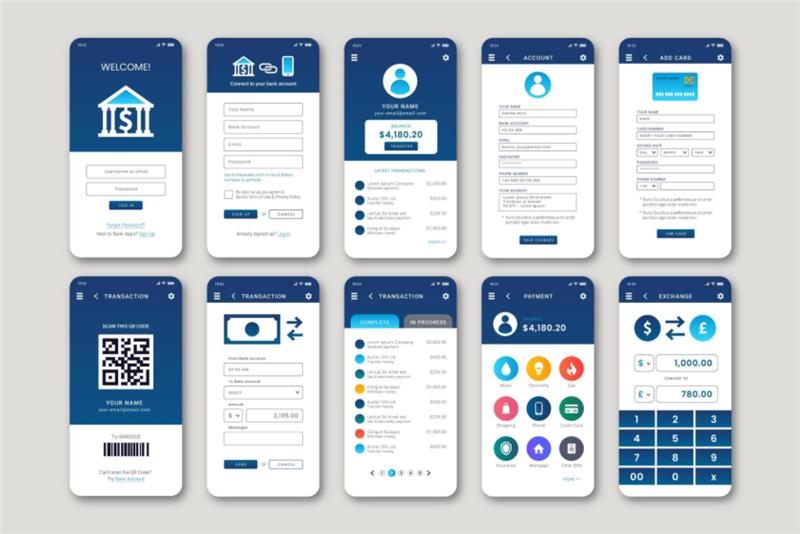
Mobile app retention UX is the practice of designing experiences. This is a core focus area within modern UI/UX design services for mobile apps:
- Help users understand value instantly
- Reduce cognitive and interaction friction
- Encourage repeat engagement
Unlike traditional UX, which focuses on usability, retention UX focuses on behavioural outcomes. It answers one question: “Will the user come back?”
Retention is measured through metrics like:
- Day 1 and Day 7 retention
- Time to First Value (TTFV)
- First-session completion rate
According to Toptal’s onboarding UX guide, onboarding quality directly impacts whether users stay or abandon the app after first use.
The First 5 Minutes: Where Retention Is Won or Lost
The first session is not just an introduction. It is a decision point. Studies show that most apps lose 60–80% of users within the first week, often because users never reach a clear “aha moment”.
Here is what happens psychologically:
- Users arrive with curiosity
- They scan for value
- If effort > clarity → they leave
This is why the most important principle in modern UX is value before effort. This principle is critical in user experience design for mobile applications, where early engagement defines retention. If users need to think too much before experiencing benefit, they will not stay.
Onboarding UX in 2026: From Tutorials to Activation
The Shift That Changed Everything
Traditional onboarding taught users how to use the app. Modern onboarding helps users experience value immediately. This is where expert-led mobile app onboarding UX design plays a crucial role.
Mobile App Onboarding Best Practices in 2026
- Progressive onboarding (learning while doing)
- Contextual tooltips instead of long tutorials
- Personalised entry experiences
- Clear next actions
Multiple research show that apps using progressive disclosure and contextual onboarding significantly improve retention by reducing early overwhelm.
What Kills Retention Instantly
- Long onboarding flows
- Forced sign-ups before value
- Permission requests without context
- Static walkthrough screens
Data shows onboarding flows longer than 5 steps can reduce completion rates by 10–15% per additional screen.
Time to First Value (TTFV): The Metric Most Teams Ignore
TTFV measures how quickly a user experiences meaningful value.
And it is one of the strongest predictors of retention.
- Users who don’t see value within 60 seconds rarely return
- Apps that reduce onboarding complexity significantly lower abandonment rates
How to Reduce TTFV
- Show usable content immediately
- Use demo states or previews
- Pre-fill data where possible
- Delay non-essential steps
- The goal is simple: Make th
The goal is simple: Make the app useful before asking the user to invest effort.
Friction Points That Quietly Kill Retention

Most teams fix visible problems. But retention is often lost due to invisible friction.
Common Frictions
- Too many steps
- Slow load times
- Confusing navigation
- Early permission requests
Hidden Frictions
- Lack of trust (why do you need my data?)
- Decision fatigue
- No feedback after actions
Even small UX improvements can lead to significant retention gains. Research highlights that intuitive navigation and performance optimization directly improve engagement and retention.
A Practical Framework: Designing the First Session
To simplify retention-focused UX, here is a working model:
A.C.T.I.V.A.T.E Framework
Attract: Clear value proposition instantly
- Clarify: What can I do here?
- Trigger: Prompt first action
- Interact: Smooth, guided flow
- Value: Deliver a quick win
- Assist: Provide help without clutter
- Trust: Build credibility early
- Engage: Encourage next step
Top-performing apps do not overwhelm users. They guide them toward one meaningful action.
Designing Beyond the First Session: Building Habit
Retention is not just about onboarding. It is about forming habits.
Apps that succeed create loops:
- Trigger → Action → Reward → Repeat
UX patterns that improve retention by up to 40–60% include:
- Personalisation
- Feedback loops
- Micro-rewards
- Clear progression systems
Notifications also matter, but only when timed correctly. Poorly timed notifications increase churn instead of reducing it.
Micro UX Elements That Drive Retention
Small details create big impact.
- Empty states: Guide users instead of leaving them stuck
- Loading states: Reduce anxiety
- Error messages: Help users recover quickly
- Microcopy: Reduce hesitation
These elements reduce friction at critical moments and keep users moving forward.
Metrics That Actually Measure UX Success
Retention-focused teams' track:
- Activation rate
- First session duration
- Drop-off points
- Feature adoption
- Repeat usage
For example, users who spend more time in their first session are significantly more likely to return, making session length a strong retention indicator.
Real World Case Studies
UX Case Studies: How High-Retention Apps Actually Do It
Duolingo: Gamification That Builds Habit
Duolingo drives retention by turning learning into quick, rewarding actions. Users start lessons instantly, with no heavy onboarding. Streaks, XP, and instant feedback create a habit loop that keeps users returning daily. The app removes friction and reinforces progress at every step.
Takeaway: Make the first action easy and rewarding, then build consistency through visible progress.
Swiggy: Instant Value Through Speed
Swiggy minimises friction by showing nearby restaurants immediately, allowing users to explore before signing up. Smart defaults like location detection and quick filters help users reach their goal fast. The app prioritizes speed and clarity, ensuring value is delivered within seconds.
Takeaway: When user intent is high, reduce steps and deliver value as fast as possible.
Zerodha (Kite): Simplifying Complex Decisions
Zerodha reduces cognitive overload in a complex domain like trading through a clean interface and focused workflows. It surfaces only essential actions while keeping advanced features accessible but not overwhelming. Trust is built through clarity and minimalism.
Takeaway: Hide complexity behind simple flows and design for confidence, not just usability.
Fintech Apps (Revolut, PayPal): Trust-Led Onboarding
Top fintech apps break onboarding into small, explainable steps and clearly communicate why sensitive data is needed. Microcopy and visual cues reduce hesitation and build trust. Instead of rushing users, they guide them through decisions.
Takeaway: In high-risk environments, trust and clarity matter more than speed.
Common Mistakes Brands Still Make
Here are 4 common mistakes that we still see brands make:
1. Designing for Features Instead of Outcomes
Many apps focus on showcasing features rather than helping users achieve a clear goal. Users do not care about what the app can do until they experience what it does for them. If the path to value is unclear, they drop off before engaging.
2. Overloading Users with Choices
Too many options in the first session create decision fatigue. When users are unsure what to do next, they tend to do nothing. A focused experience with one clear action performs far better than multiple competing choices.
3. Copying Competitors Without Context
Borrowing patterns from other apps without understanding user intent often leads to poor UX decisions. What works for one product may not work for another. UX should be driven by user behaviours, not industry trends.
4. Ignoring Emotional UX
Users do not just evaluate functionality. They respond to how the app makes them feel. Lack of trust signals, unclear messaging, or abrupt flows can create hesitation, even if the product is technically sound.
Actionable UX Checklist for Retention
- Deliver value within the first 60 seconds
- Reduce onboarding to 3–5 steps
- Allow users to explore before signup
- Delay permissions until necessary
- Guide users with context, not tutorials
- Focus on one clear “aha moment”
Conclusion
Users do not stay because your app is powerful. They stay because it feels effortless.
The apps that win in 2026 are not the ones with the most features, rather they are the ones who respect user attention, reduce friction, and deliver value immediately. Because in today’s market, users don’t explore apps.
Great UX is not accidental. It is designed with intent, tested with users, and refined through data.
If you are building or scaling a mobile app and want to improve retention, our team can help you design and develop experiences that users actually stay for.
Get in touch with Openspace Services to discuss your mobile app development and UI/UX needs.